Deliverables
Invitation
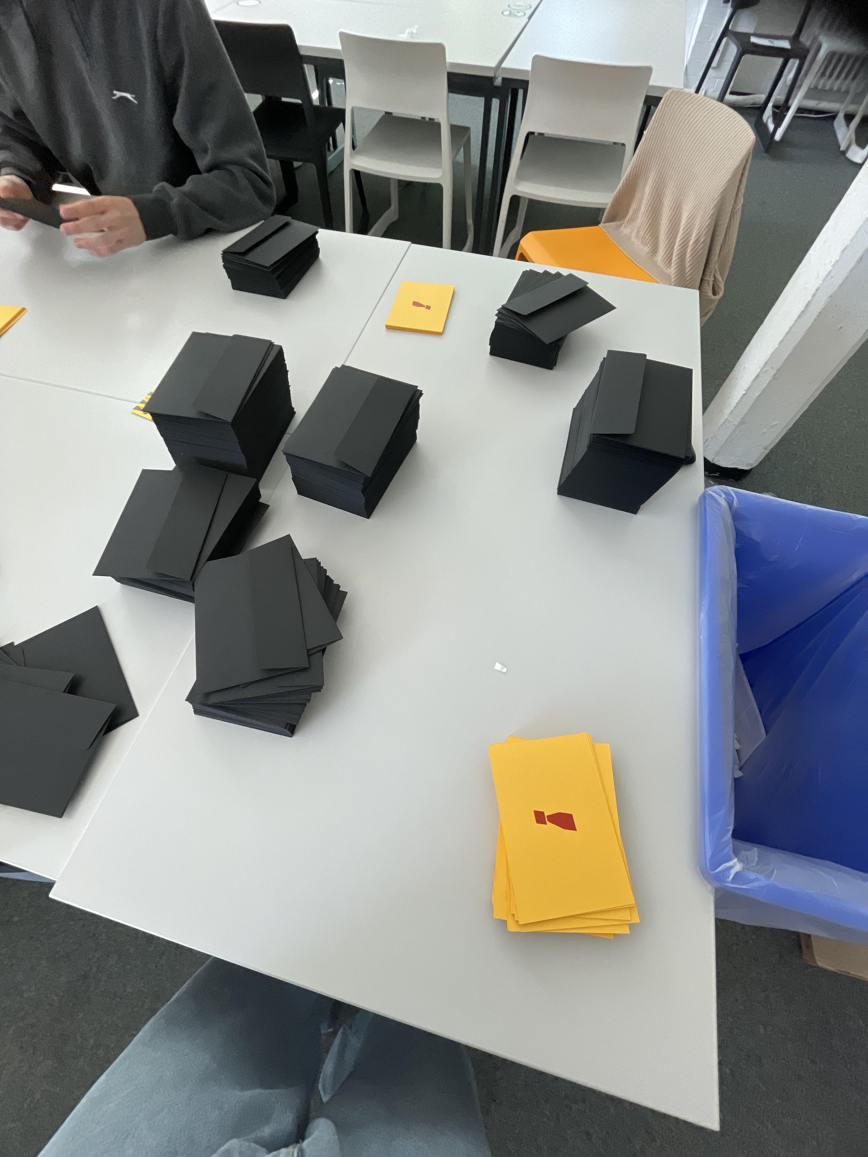
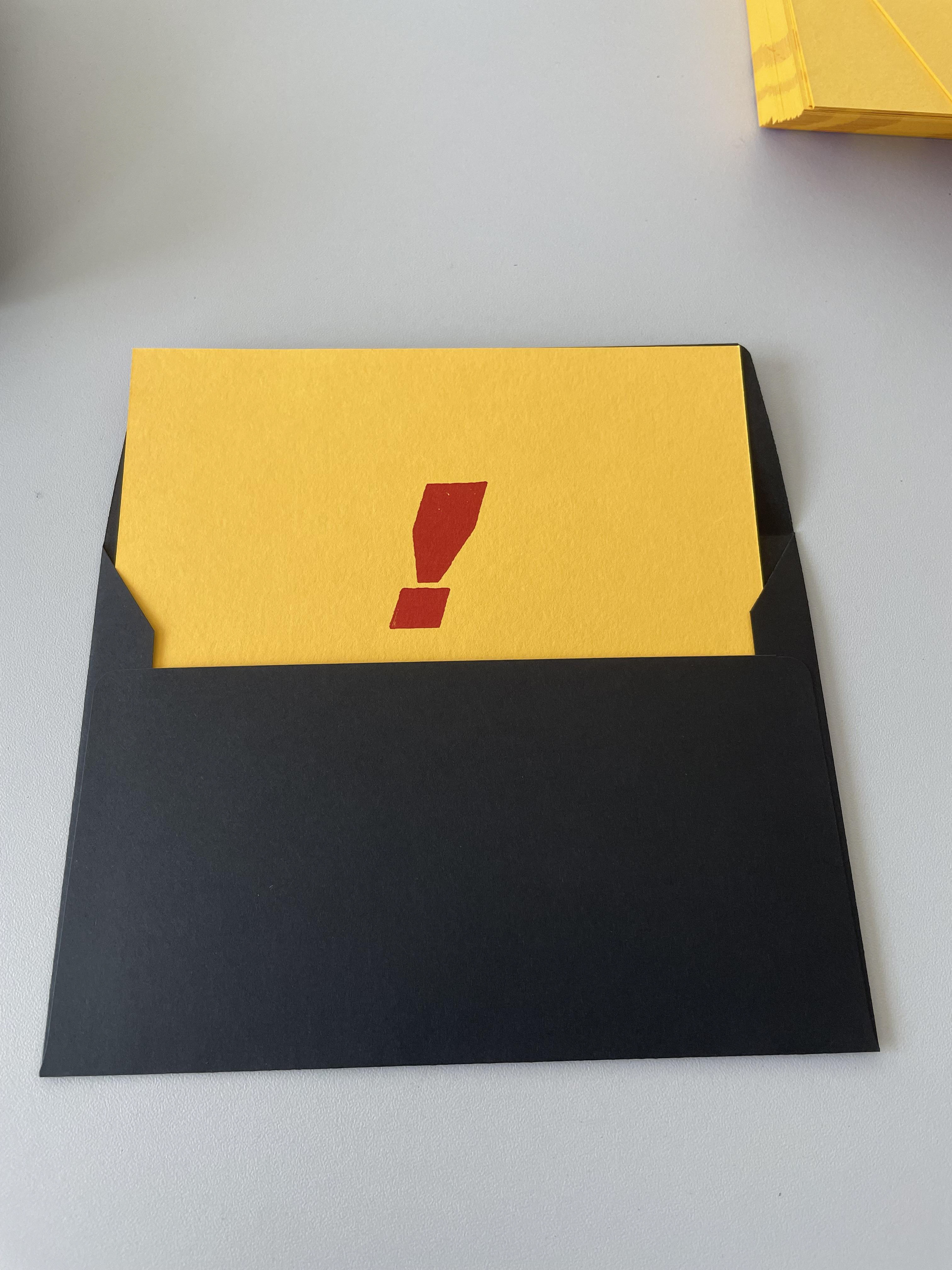
This was a large project with multiple deliverables that needed to all be completed to a very strict deadline so that the degree show didn't look rushed and everyone who could come was invited. Once we had found our identity, our next job was to hand out physical invitations to over 1000 people. This meant coming up with a unique design for the invitation and then working as a group to fill and stamp each envelope. We chose a black envelope to not only be in keeping with our colour palette but also so that the invitation has a presence and can stand out nicely against the card.


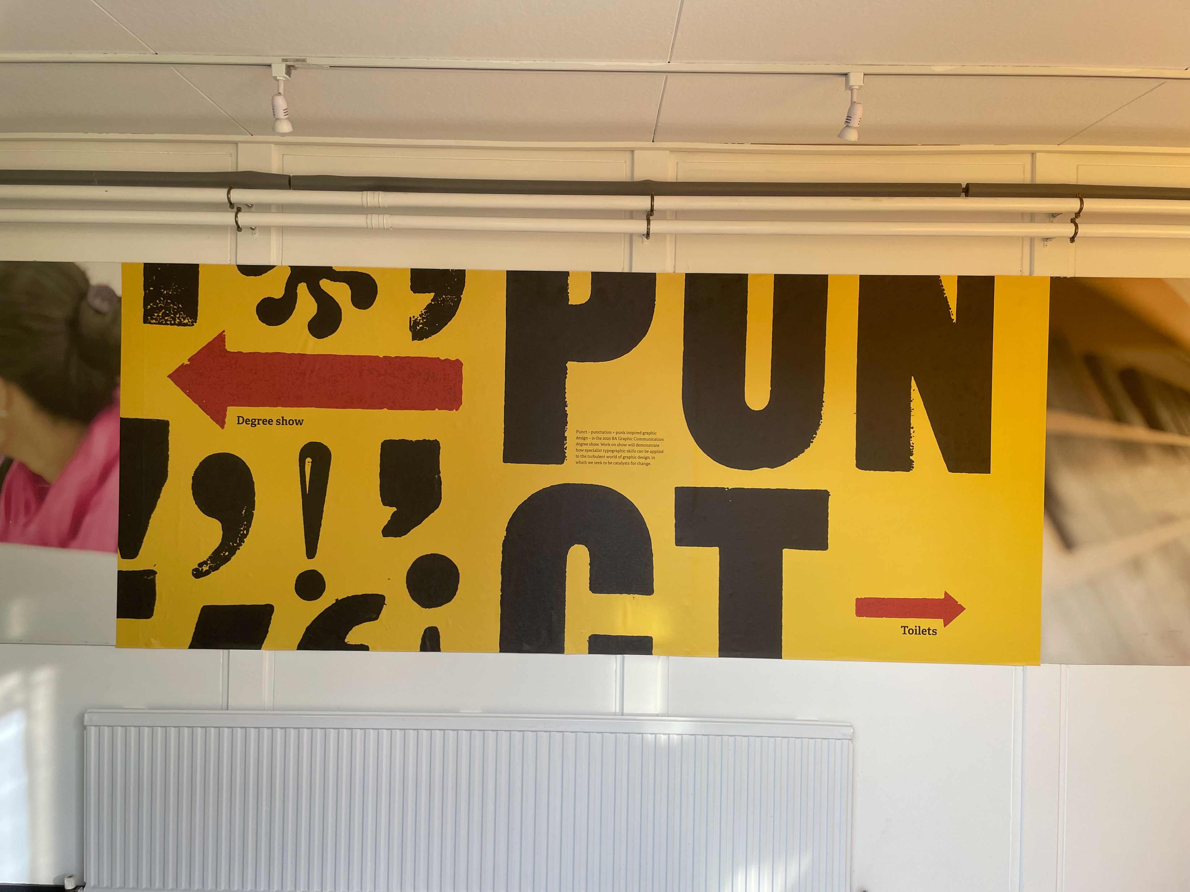
Entrance panel
This deliverable would prove the most taxing as it meant working at a huge size. This meant that our punctuation scans had to be of an extremely high quality while not losing any of the texture. This came out very well and was said to be a great opening sight to the degree show. We also took advantage of the windows as using as much of the physical space was very important to keep the visitors immersed in the experience.


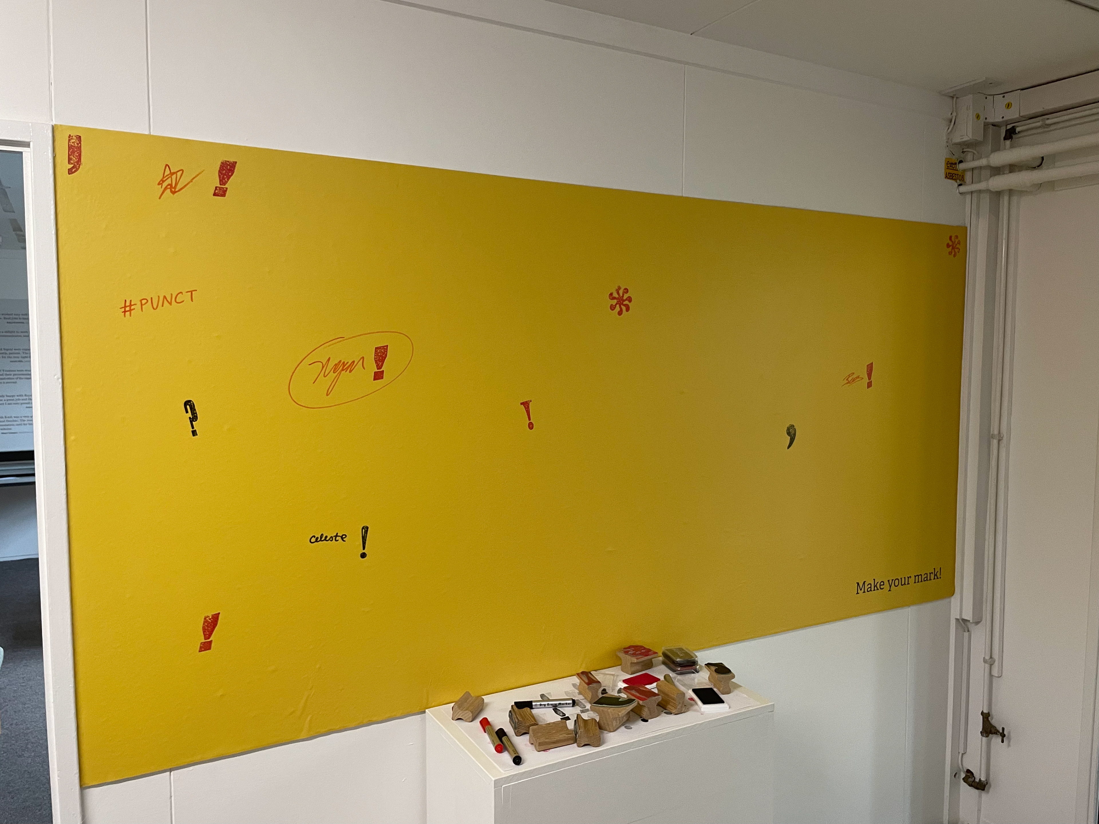
Stamp panel
We knew we wanted to have an interactive element in our show so that the visitors can make their own mark. This idea developed throughout the design process, changing from just having a pun for which people could write a little message to designing and ordering ten different stamps that all use the brands punctuation we had previously used. This was then coupled with pens and two different colours of ink, black and red, so that visitors could have a fun and experiment with multiple ways of making their mark. This was for a lot of people we spoke to their favourite element of the show. The images bellow show the beginning and end of the stamp panel for the first day of opening.


Instagram & Website
Check out the degree show's Instagram and website we designed for the show that showcases a selection of work from each student. They also follows the design principles used across the rest of the branding.